Weather guides
Honest, sourced explainers on how forecasting actually works, and how to read the disagreement between models.
The national forecast models, explained: NBM, UKMO, GEM and ACCESS
Beyond the global giants, each country runs its own official weather model tuned to its own skies. Here is what the USA, UK, Canada and Australia use, and who runs them.
Read guide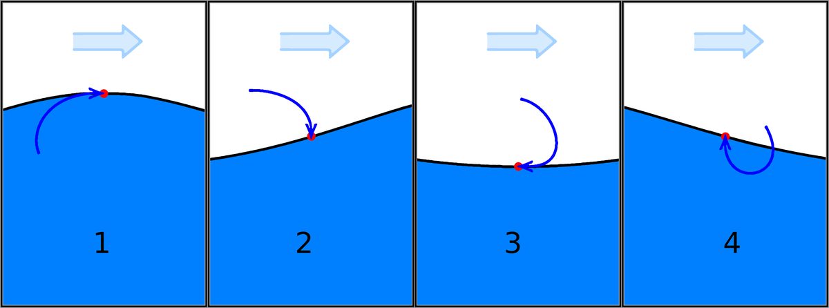
Super El Nino and ENSO in 2026: What It Really Means for Your Forecast
A moderate El Nino is already underway and forecasters give it a strong chance of reaching Super El Nino strength by early 2027. Here is the honest picture, and why it makes seasonal outlooks harder to call.
Read guide
Is Apple Weather Accurate? Here Is the Honest Answer
Apple Weather does not make its own forecast. It blends other people's models and shows you one number. That single fact explains almost everything about when it is right and when it lets you down.
Read guide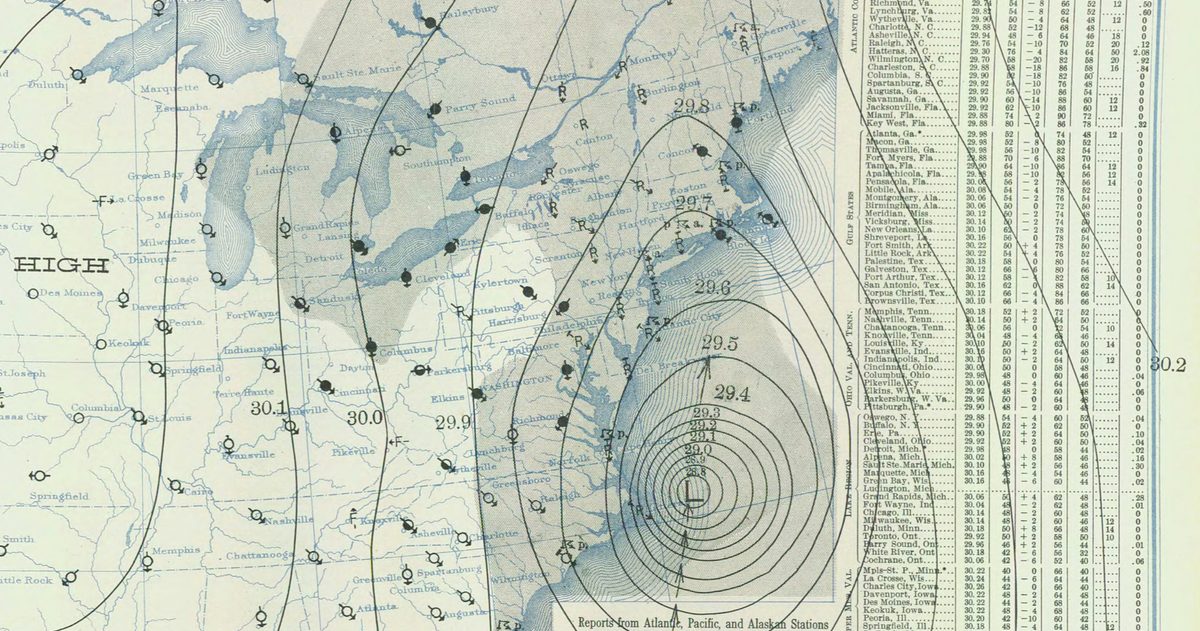
How Does Weather Forecasting Work? A Plain-English Guide
A no-jargon tour of how a modern forecast is built, from weather balloons to supercomputers, and why comparing models is the smartest way to read one.
Read guide
Is AccuWeather Accurate?
AccuWeather is dependable for the next few days, but its long-range forecasts push past what any model can actually predict.
Read guide
Is the Weather Channel App (weather.com) Accurate?
weather.com is dependable for the next several days, but its extended outlook and precipitation odds are easy to misread.
Read guide
Is Google Weather Accurate?
Google Weather inherits its accuracy from weather.com, adds a clean interface, and is starting to lean on its own AI models.
Read guide
Best Weather App for the US in 2026
There's no single winner - the right app depends on whether you want accuracy, radar depth, or a look under the hood.
Read guide
NWS vs Weather Apps: Which Should You Actually Trust?
Apps are fine for convenience, but only the National Weather Service issues the warnings that matter when lives are on the line.
Read guide
Is Windy Accurate for US Forecasts?
Windy is only as accurate as the model you pick, because it doesn't make a forecast of its own.
Read guide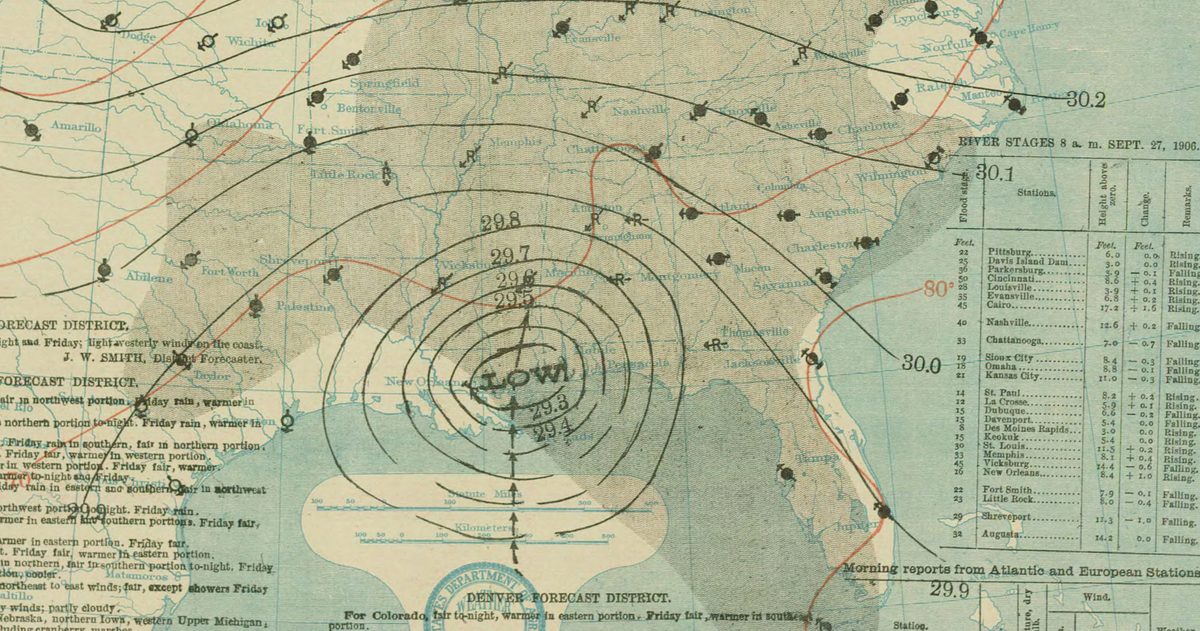
What Weather Model Does the US Use? The GFS, Explained
America's flagship forecast model is the GFS, a free global model run four times a day by NOAA.
Read guide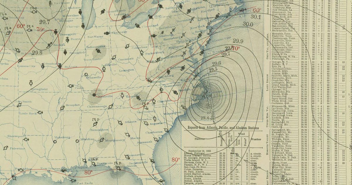
GFS vs ECMWF: Why the European Model Often Beats the American One
The Euro tends to lead in medium-range accuracy, and Hurricane Sandy in 2012 is the textbook proof.
Read guide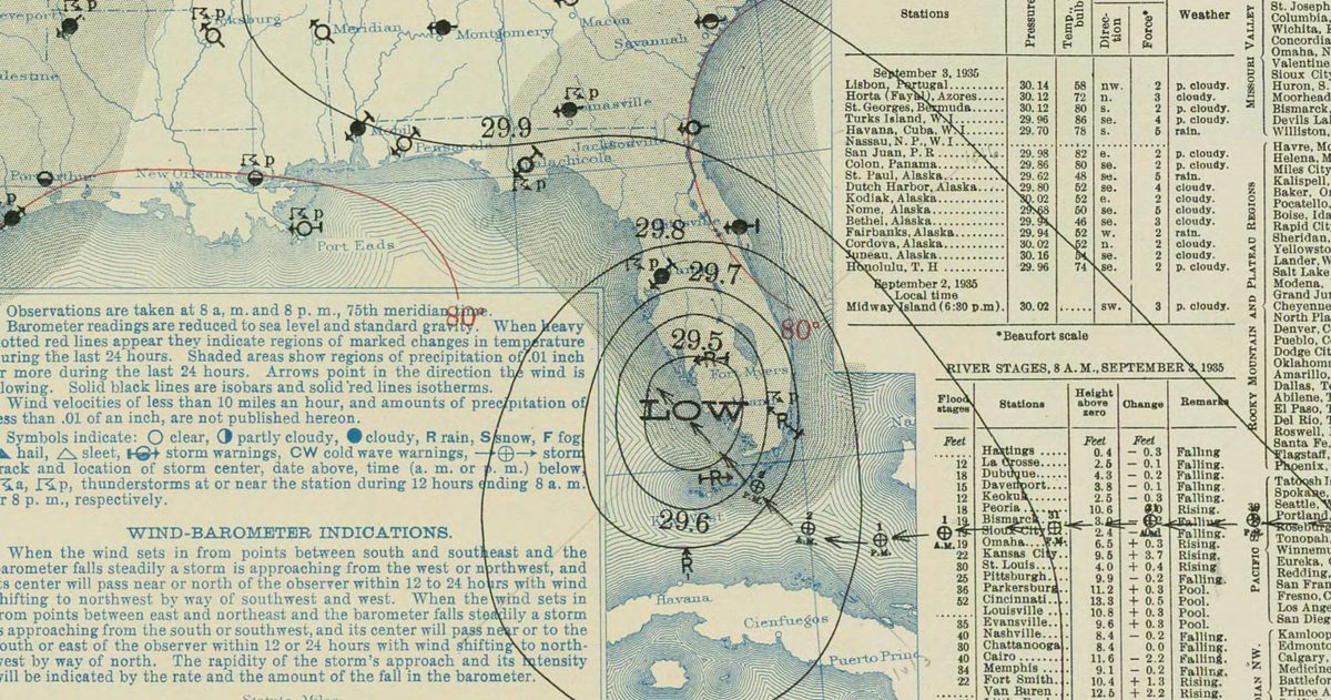
How Far Ahead Can You Actually Trust a US Forecast?
A 5-day forecast is about 90% reliable; by day 10 you are near a coin flip.
Read guide
Why Do Weather Forecasts Disagree?
Different models, different data, and a chaotic atmosphere mean disagreement is normal, and useful.
Read guide
How Accurate Is a 10-Day Forecast?
Long-range forecasts aren't guesses, but they aren't guarantees either. Here's the honest, day-by-day reliability picture.
Read guide
The 'Cone of Uncertainty': What It Really Means
The most misunderstood graphic in hurricane season, decoded, including what it deliberately leaves out.
Read guide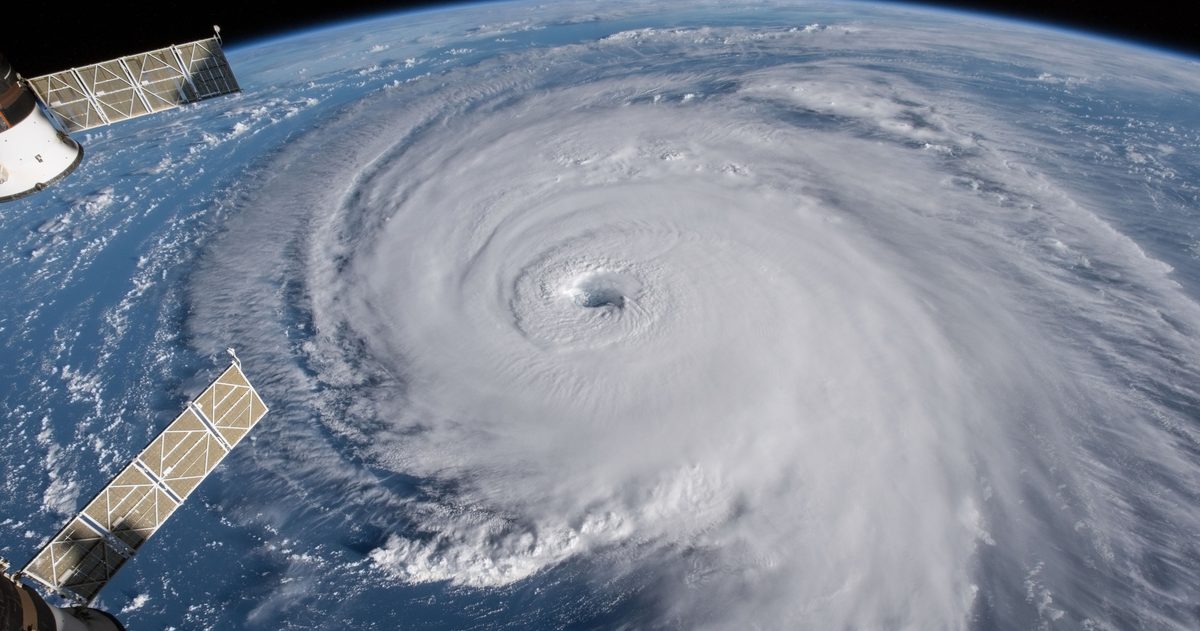
Hurricane Season 2026: What the Models Are Signaling
Seasonal outlooks are about odds and ingredients, not named storms. Here's how to read the 2026 signals without falling for hype.
Read guide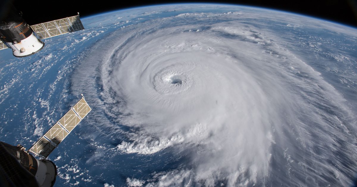
When Does US Hurricane Season Start and Peak?
The official dates, the mid-September peak, and why storms sometimes ignore the calendar.
Read guide
Polar Vortex Explained: Will It Hit the US This Winter?
What the polar vortex actually is, how it breaks down, and why 'when' it spills south can't be pinned down far ahead.
Read guide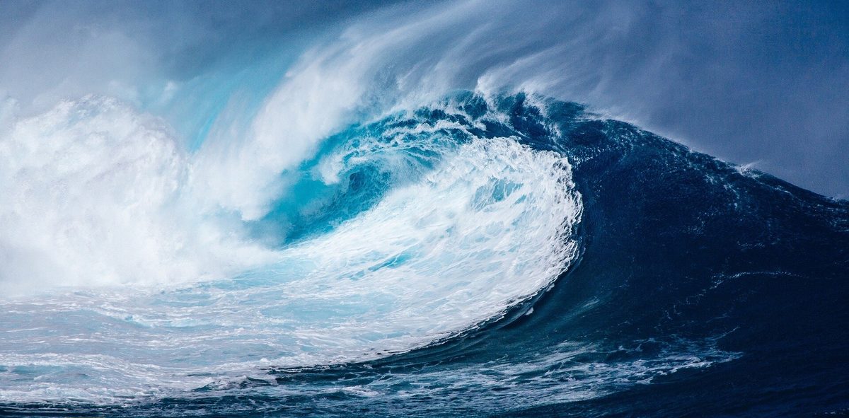
El Nino vs La Nina: What They Mean for US Weather
The two phases of the ENSO cycle nudge the jet stream in opposite directions, reshaping US winters region by region.
Read guide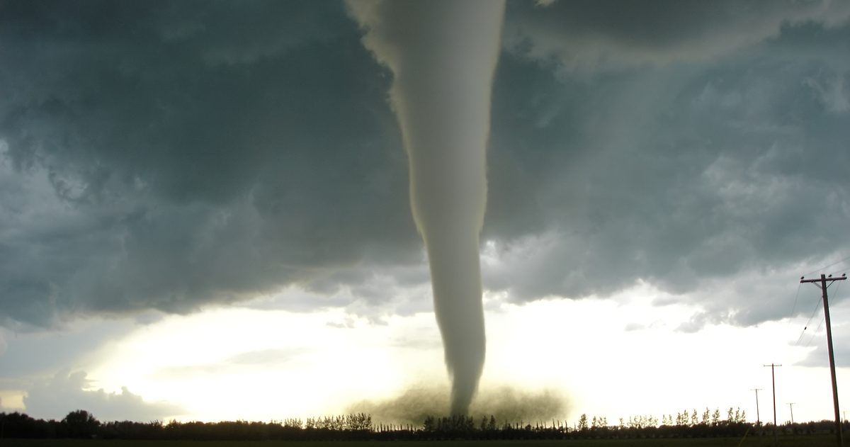
US Tornado Season: When and Where It Peaks
There is no single tornado season; the peak migrates north and east with the calendar, and two regions dominate the map.
Read guide
Heat Dome Explained: Why US Heat Waves Keep Breaking Records
A stubborn ridge of high pressure sinks and compresses air over a region, cooking it for days on end.
Read guide
First Frost Dates Across the US
First-frost timing sweeps from the northern Rockies in September to the Gulf Coast in late fall, and it's a probability, not a promise.
Read guide
How to Read a US Weather Radar
Once you know what reflectivity, dBZ, velocity, and the base-versus-composite views actually show, a radar map tells a real story.
Read guide
What "Chance of Rain" Actually Means
The National Weather Service has a precise definition of that percentage on your forecast - and it's almost certainly not the one you think.
Read guide
Wind Chill vs "Feels Like": How the US Measures It
Your app's "feels like" number is really one of two different NWS formulas - wind chill when it's cold, heat index when it's hot.
Read guide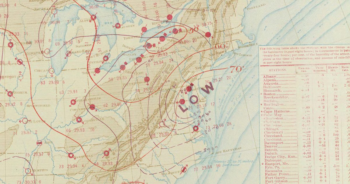
The Best Time to Check the Forecast Before You Travel
One glance a week out isn't enough - here's a simple three-check routine timed to when forecasts actually get reliable.
Read guide
Weather Watch vs Warning: What the Difference Means for You
The two words look similar and mean very different things - knowing which is which can be the difference between preparing and taking shelter.
Read guide
How to Plan Around the Weather With Model Data
A practical guide to using model agreement and ensemble spread - not just one number - to know how much to trust a forecast.
Read guide
Is the Met Office app accurate?
The Met Office app is one of the most reliable forecasts you can get in the UK, especially for warnings and short-range detail - but no single app is right every time, and knowing why is half the battle.
Read guide
Is BBC Weather accurate?
BBC Weather is a solid, well-presented forecast - but a common myth is that it comes from the Met Office. Since 2018 it has been powered by a different provider, and knowing that changes how you should read it.
Read guide
Is the Apple Weather app accurate in the UK?
Apple Weather has come a long way since the shaky Dark Sky days, and for glanceable UK forecasts it is genuinely good - but for warnings and knife-edge days, it is not where you should stop looking.
Read guide
Best weather app UK 2026
There is no single best weather app for everyone - the right one depends on whether you value official warnings, hyperlocal rain, clean design or an honest read on forecast confidence. Here is how the main UK options compare.
Read guide
Met Office vs weather apps: which to trust?
When your phone's weather app disagrees with the Met Office, which one is right? Usually neither is simply wrong - the disagreement itself is the most useful information you have.
Read guide
Is Windy accurate for UK forecasts?
Windy is a display, not a forecaster. Its accuracy depends entirely on which model you view and how far ahead you look.
Read guide
What weather model does the UK use?
Britain's forecasts are built on the Met Office Unified Model - a single modelling system that scales from the whole globe down to a 1.5 km UK grid.
Read guide
ECMWF vs the Met Office model: how they compare
They are not really rivals - ECMWF is the world-class medium-range global model, the Met Office adds high-resolution UK detail, and forecasters use both.
Read guide
How far ahead can you trust a UK forecast?
Reliable to roughly five days, useful to about a week, and only a broad steer beyond - here is why the atmosphere sets that limit.
Read guide
Why do weather forecasts disagree?
Two apps, two answers: usually it's different models, different update times and different ways of turning raw data into an icon.
Read guide
Met Office weather warnings explained: yellow, amber and red
The colours are not about how bad the weather is on its own - they are about impact and likelihood combined. Here is how to read them properly.
Read guide
How are UK storms named?
Storms hitting the UK, Ireland and the Netherlands share a single annual A-Z list - and they only earn a name when the weather is serious enough to warrant it.
Read guide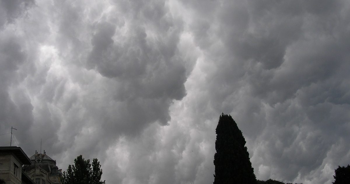
The jet stream and UK weather
One fast ribbon of high-altitude wind decides whether Britain gets Atlantic storms, a summer heatwave or a locked-in cold snap. Here is how it works.
Read guide
When is the UK's stormiest season?
Britain's wildest weather clusters in the darker half of the year - and it is no accident. The Atlantic, the jet stream and a big temperature contrast all line up.
Read guide
How accurate is a 14-day UK forecast?
Beyond about a week, a UK forecast stops predicting specific days and starts hinting at trends. Here is why - and how to read a 14-day outlook without being misled.
Read guide
What causes UK heatwaves?
Blocking high pressure, hot air dragged up from Iberia and North Africa, and a jet stream that shifts north are the three ingredients behind almost every UK heatwave.
Read guide
Will the UK have a white Christmas?
Officially, it only takes a single snowflake falling somewhere in the UK on 25 December, which happens surprisingly often. A deep, lying, card-cover of snow is genuinely rare.
Read guide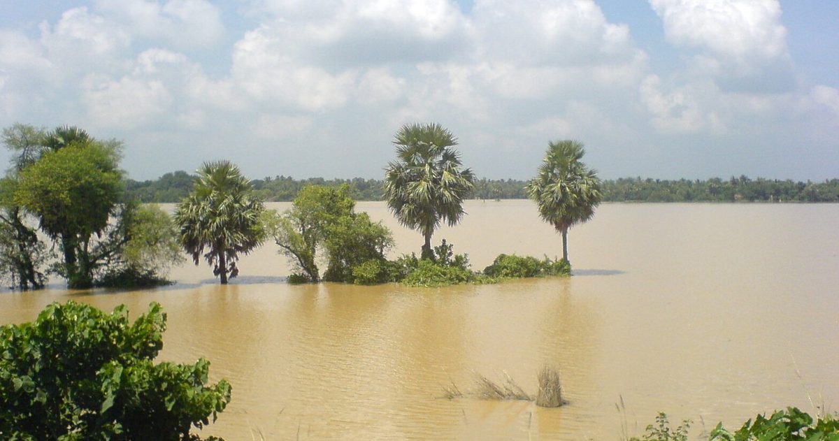
Why is UK flooding getting worse?
Heavier rainfall in a warming climate, rising seas, and more paved-over ground are combining to push more water into rivers, drains and homes than the system was built to cope with.
Read guide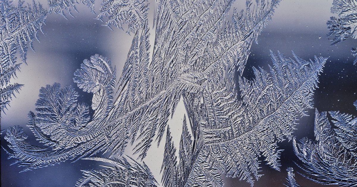
When does the UK get its first frost?
The first frost sweeps south and downhill through autumn: Scottish glens and inland uplands in September, lowland England in October and November, and mild coasts and cities later.
Read guide
How to read UK rain radar
Rainfall radar turns invisible raindrops into a live colour map: cool colours mean light rain, warm colours mean heavy. Learn the scale, the movement, and the traps.
Read guide
What does 'chance of rain' mean on the Met Office forecast?
The percentage is a probability of any measurable rain at your exact spot - not how much, how long, or how much of the map gets wet.
Read guide
'Feels like' temperature explained (UK)
Why the Met Office says it feels colder - or warmer - than the thermometer reads, and how wind and humidity drive the difference.
Read guide
The best time to check the forecast before you travel (UK)
Forecasts sharpen as the day approaches. Here is when to look, what each check can tell you, and the final look that matters most.
Read guide
What is a Met Office weather warning vs an alert?
Warnings, health alerts, flood alerts and Emergency Alerts all mean different things. A precise guide to who issues each and what to do.
Read guide
How to plan around UK weather using model data
The major forecast models don't always agree - and that disagreement is the most useful signal you can plan around.
Read guide
Is The Weather Network app accurate?
Canada's most-downloaded weather app is dependable for day-to-day planning, but its accuracy depends heavily on how far ahead you look and how volatile the setup is.
Read guide
Is Environment Canada (weather.gc.ca) accurate?
Environment Canada is the country's official source for weather warnings and runs the GEM model. In our dated tests GEM ranked second of three models in Canada, and like every forecast it loses precision with each day ahead.
Read guide
Is Apple Weather accurate in Canada?
Apple Weather is good enough for daily glances on an iPhone, and its data sources include ECCC, but its minute-by-minute rain forecast is not offered in Canada, and its severe-weather coverage is weaker than the app makes it look.
Read guide
Best weather app in Canada 2026
There is no single winner: the best weather app depends on whether you want official warnings, the richest visuals, or a transparent view of how much the forecast models actually agree.
Read guide
Environment Canada vs weather apps: which to trust?
Trust Environment Canada for warnings and as your source of truth, use consumer apps for convenience and radar, and let the agreement between forecast models decide how much to trust any forecast at all.
Read guide
Is Windy Accurate for Canadian Forecasts?
Windy forecasts nothing on its own - it renders global models that were never tuned for Canadian terrain, and it leaves out ECCC's high-resolution GEM.
Read guide
What Weather Model Does Canada Use? The GEM Model Explained
Canada's forecasts run on GEM - Environment Canada's Global Environmental Multiscale model - in three tiers: global GDPS, regional RDPS and high-resolution HRDPS.
Read guide
GEM vs ECMWF vs GFS: How Canada's Model Compares
ECMWF usually leads global accuracy, GFS and ICON follow, and GEM stays competitive - but Canada's high-res HRDPS can beat them all for local detail.
Read guide
How Far Ahead Can You Trust a Canadian Forecast?
Reliable for about three days, useful for pattern out to seven, and an outlook beyond ten. Here is the measured error for each day ahead, why it grows, and how to read each range in Canada.
Read guide
Why Do Weather Forecasts Disagree?
There's no single forecast - just competing models starting from different data and physics. In a chaotic atmosphere, their disagreement is a signal, not an error.
Read guide
Environment Canada weather alerts: what yellow, orange and red mean
On 26 November 2025 ECCC added a colour to every watch, advisory and warning and replaced its fixed criteria with Weather Impact Guides. How the colour is chosen and how to read it.
Read guide
Canadian winter storms explained: Colorado lows, nor'easters and Alberta clippers
Most big Canadian winter storms belong to one of three families defined by where they are born. Knowing the type tells you what weather to expect.
Read guide
Wind Chill in Canada: How Is It Actually Calculated?
Canada has used the wind chill index it developed with the United States since 2001. The formula, when ECCC reports it, the frostbite risk it flags, and how cold warnings work since the November 2025 change.
Read guide
The polar vortex and Canadian winters
The polar vortex is a permanent ring of Arctic cold, not a storm. Canadian cold snaps happen when it weakens or splits and lets that cold spill south.
Read guide
How accurate is a 14-day Canadian forecast?
A 14-day forecast is a rough steer, not a day-by-day plan. Here is where forecast skill drops off, why, and how to read the back half of any long-range forecast.
Read guide
What causes Canadian heat waves?
Persistent upper-level ridges of high pressure, often held in place by a stalled jet stream, trap sinking, warming air over a region for days. That is what built the June 2021 heat dome and Canada's record of 49.6 °C.
Read guide
Will Canada have a cold, snowy winter? How seasonal outlooks really work
An honest answer months ahead is 'here are the odds,' not 'yes.' Seasonal outlooks give probabilities - a lean toward warmer, colder or near-normal - not a day-by-day forecast. Here is how they are built and what they can and cannot tell you.
Read guide
Canadian tornado season: when and where
Canada records more tornadoes than any country except the United States. The season peaks from June through August, concentrated across the southern Prairies and southern Ontario - the two zones sometimes called Canada's tornado alleys.
Read guide
When does Canada get its first frost?
Frost arrives earliest in the North and the high Prairies - sometimes by late August - and latest along the mild south coast of British Columbia and the far south, where it can hold off until late October or beyond. Elevation, water and city warmth all shift the date.
Read guide
How to read Canadian weather radar
ECCC's radar sends out radio pulses and measures the echo bouncing off raindrops, snow and hail. Colours show intensity from light green to deep red; the brighter the colour, the heavier the precipitation. Here is how to read the map with confidence.
Read guide
What Does “Chance of Rain” (POP) Mean on an Environment Canada Forecast?
The probability of precipitation is the most misread number in any Canadian forecast. Here's what ECCC's percentage actually measures - and what it doesn't.
Read guide
Humidex Explained: Canada's Version of the Heat Index
Canada measures humid heat with its own index. How ECCC calculates the humidex, what the numbers mean, why it differs from the US heat index, and what triggers a heat warning since the November 2025 change.
Read guide
The Best Time to Check the Forecast Before You Travel (Canada)
Environment Canada updates forecasts several times a day, and the models behind them run on a schedule. Here's how to time your checks so you plan on fresh data.
Read guide
Environment Canada: special weather statement vs watch vs advisory vs warning
Since 26 November 2025 a special weather statement is no longer an alert, and every watch, advisory and warning carries a colour. What each type means and what ECCC tells you to do.
Read guide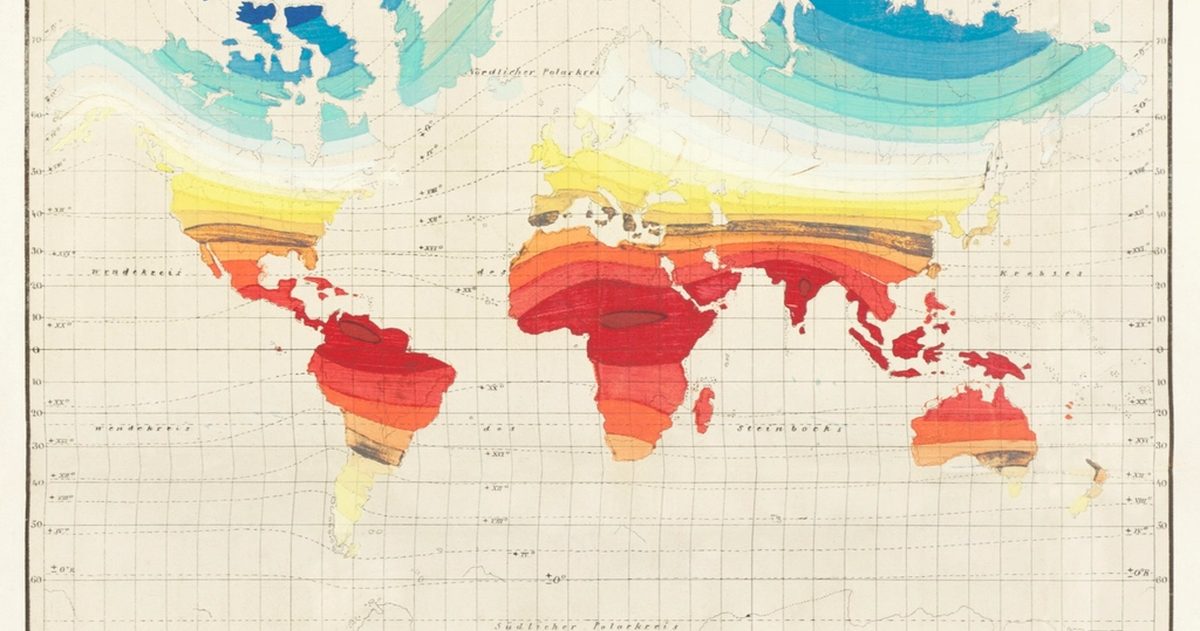
How to Plan Around Canadian Weather Using Model Data
The pros don't trust one forecast - they compare models. Here's how to match GEM, ECMWF, GFS and the HRDPS to your lead time and read their agreement as confidence.
Read guide
Is the MetService app accurate?
MetService is New Zealand's official forecaster, so its app carries real authority. But accuracy varies by timeframe and terrain here is where it earns its keep and where it falls short.
Read guide
Are WeatherWatch and MetVUW accurate?
WeatherWatch and MetVUW are the best-known independent forecasters in New Zealand. Both are genuinely useful but they work very differently, and neither replaces the official warning authority.
Read guide
Is Apple Weather accurate in New Zealand?
Apple Weather is on every iPhone in the country, so it's the forecast most New Zealanders glance at first. It's decent for a quick look but it has real blind spots here.
Read guide
Best weather app in New Zealand (2026)
There's no single best app for everyone the right choice depends on whether you want official warnings, raw charts or a quick glance. Here's how the main options rank, and who each suits.
Read guide
MetService vs weather apps: which should you trust?
MetService is the official authority; the apps on your phone are mostly automated model blends. Knowing the difference and when it matters is the key to trusting the right forecast.
Read guide
Is Windy accurate for New Zealand?
Windy is a display, not a forecaster. Its accuracy over New Zealand depends entirely on which model you choose and how far ahead you look.
Read guide
What weather models forecast New Zealand?
New Zealand forecasts rest on a handful of global heavyweights plus MetService's local models. Knowing which is which explains why forecasts differ.
Read guide
ECMWF vs GFS for New Zealand
The European and American models are the two giants of global forecasting. For New Zealand, each has clear strengths, and knowing them makes you a sharper forecast reader.
Read guide
How far ahead can you trust a New Zealand forecast?
There is a real limit to forecast skill. Knowing where reliability fades, and why New Zealand tests it harder than most, makes every forecast more useful.
Read guide
Why do weather forecasts disagree?
Two apps, two different answers for the same afternoon. The reason is not carelessness: it is that they are running different models, and disagreement is useful information.
Read guide
MetService weather warnings explained: watch, warning, orange and red
New Zealand's alert system decoded - what a Watch means, what a Warning means, and why the colour matters.
Read guide
Why is New Zealand's weather so changeable?
A thin, mountainous country in the westerly wind belt, ringed by ocean - the recipe for weather that turns on a sixpence.
Read guide
The Roaring Forties and New Zealand's weather
The near-permanent westerly winds that put the wind at New Zealand's back - and the fronts on its doorstep.
Read guide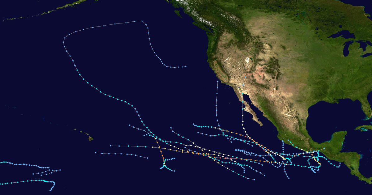
Ex-tropical cyclones and New Zealand
How tropical storms lose their warm heart on the way south - and why they can still be so destructive.
Read guide
How accurate is a 10-day New Zealand forecast?
Where the useful signal ends and the guesswork begins - and how to read the back half of a long-range forecast.
Read guide
What causes New Zealand heatwaves?
Blocking highs, subtropical air and the foehn effect over the Southern Alps combine to push the mercury up - and marine heatwaves keep the heat in place.
Read guide
New Zealand winter and snow: what to expect
Southern Hemisphere winter brings Antarctic southerlies, low-level South Island snow and mountain snowfalls in the North - with MetService snow and road warnings to match.
Read guide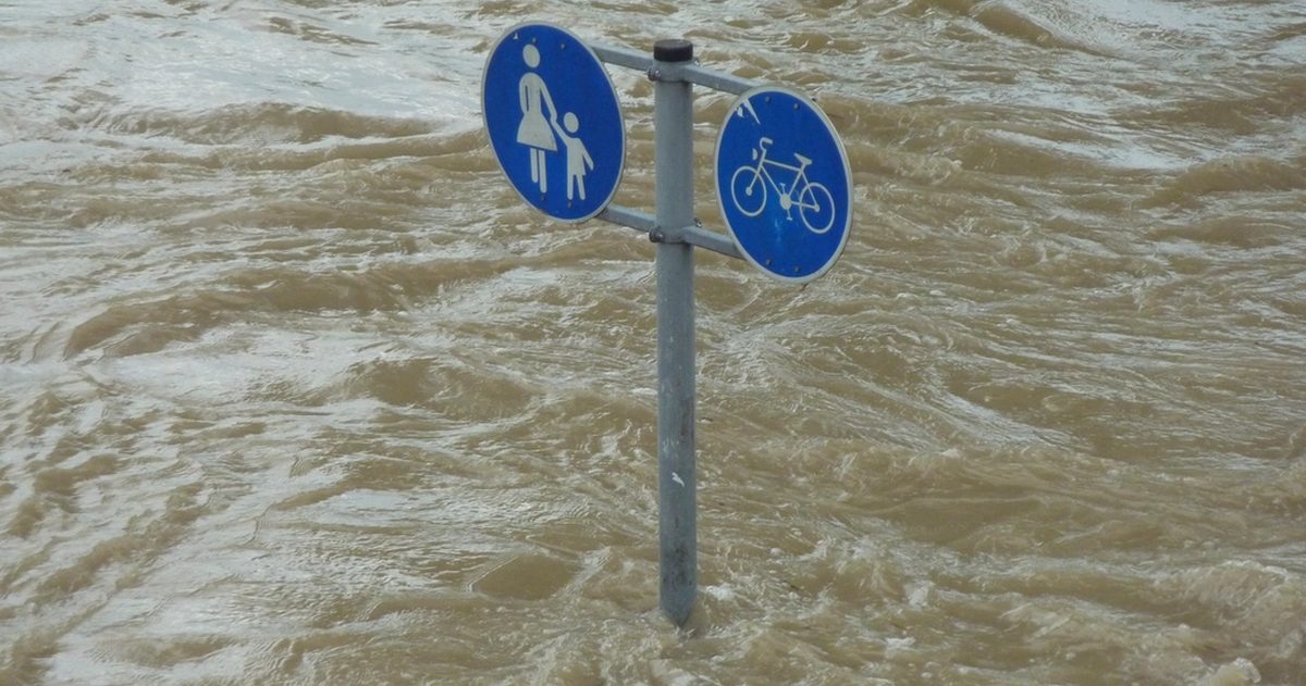
New Zealand severe weather and flooding
From ex-tropical cyclones to atmospheric rivers pinned against the Southern Alps, here is what drives New Zealand's worst flooding - and how MetService warns for it.
Read guide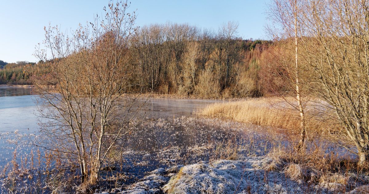
When does New Zealand get frost?
Clear, calm winter nights under a high let heat escape to space - and inland South Island frost hollows like Central Otago turn that into the country's hardest frosts.
Read guide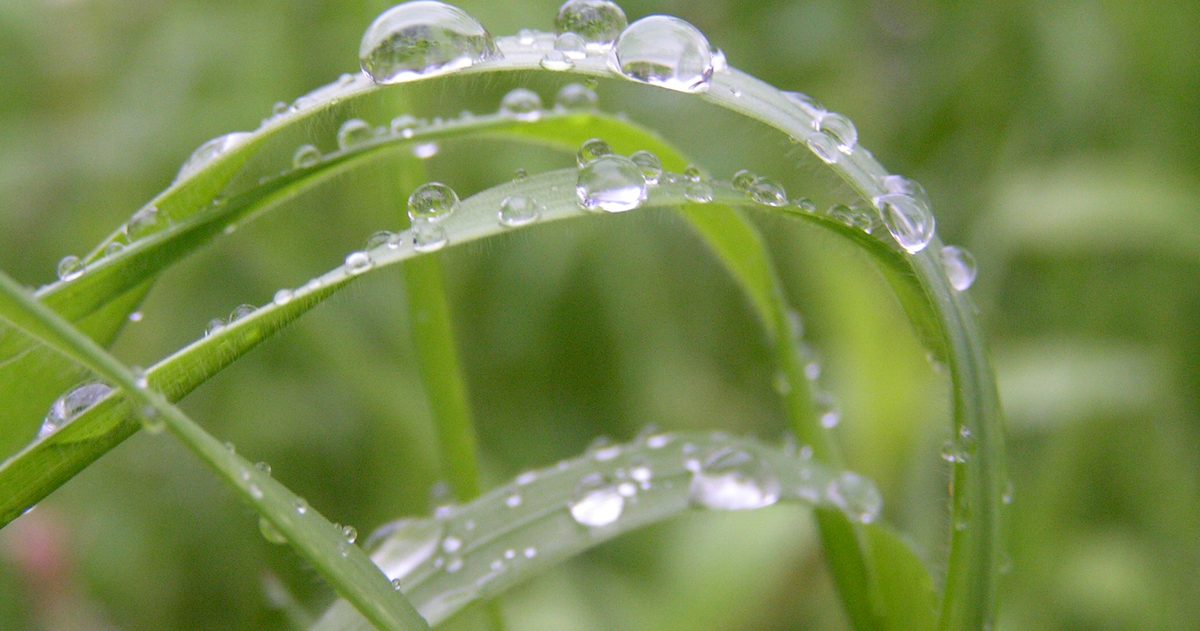
How to read New Zealand's rain radar
Colours show rainfall intensity, the animated loop shows where rain is heading - but mountains cast radar shadows. Here's how to read it like a forecaster.
Read guide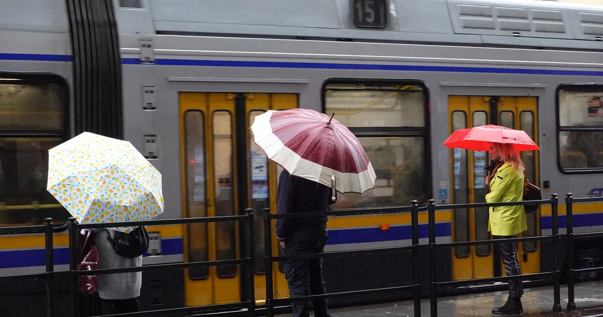
What does "chance of rain" mean on a MetService forecast?
The percentage is a probability, not an amount - here's how to read it, why two apps disagree, and how to actually use it when planning your day.
Read guide
"Feels like" temperature explained (New Zealand)
Why the number on your forecast often differs from the air temperature - and how MetService combines wind chill and humidity to tell you how the day will actually feel.
Read guide
The best time to check the forecast before you travel (New Zealand)
Forecasts refresh several times a day as new model runs land. Time your checks to the update cycle - and to how far ahead you're planning - for the most reliable read.
Read guide
MetService warning vs watch: what's the difference?
Watch means “be ready,” Warning means “take action.” Here's how MetService's three-step severe weather system works and what each colour is telling you to do.
Read guide
How to plan around New Zealand weather using model data
The forecasts on your phone come from a handful of global models. Understand how they work - and when they disagree - and you can plan with far more confidence.
Read guide
Is the BOM Weather app accurate?
The official app of Australia's national forecaster - how good are its forecasts, really?
Read guide
Is Weatherzone accurate?
One of Australia's best-known commercial weather brands - how reliable are its forecasts?
Read guide
Is Apple Weather accurate in Australia?
It's on every iPhone by default - but should Australians trust it?
Read guide
Best weather app Australia 2026
No single app wins everything - here's the honest breakdown of what to install.
Read guide
BOM vs weather apps: which to trust?
The official forecaster or the slick commercial app? Here's how to decide.
Read guide
Is Windy accurate for Australia?
Windy is a viewer for global forecast models, not a forecaster. Pick the right layer and it's superb; here's how accurate it really is for Australia.
Read guide
What weather model does Australia use?
Australia runs its own forecast model - ACCESS - at global, regional and city scales. Here's what it is, where it comes from, and why you can't see it on Windy.
Read guide
ACCESS vs ECMWF vs GFS
Australia's own model, the European heavyweight and the American workhorse compared - resolution, accuracy, cost and when to trust each.
Read guide
How far ahead can you trust an Australian forecast?
Firm to three days, useful to seven, rough beyond - here's why forecast skill fades with time, and how to tell when a particular forecast is trustworthy.
Read guide
Why do weather forecasts disagree?
Different models, imperfect starting data and a chaotic atmosphere mean forecasts diverge - and that disagreement is your best guide to how much to trust them.
Read guide
BOM weather warnings explained
A plain-English guide to Australia's warning system - what a Watch means versus a Warning, and how BOM grades cyclones, floods, fire weather and heat.
Read guide
How are Australian cyclones named and categorised?
The Bureau names every cyclone from rotating alphabetical lists and grades it 1 to 5 on wind gusts - here is how the system works and what the category leaves out.
Read guide
Australian bushfire weather & fire danger ratings explained
What drives dangerous fire weather in Australia, how the AFDRS four-level rating works since 2022, and the difference between a rating, a warning and a total fire ban.
Read guide
El Niño & La Niña and Australian weather
The Pacific climate see-saw that swings Australia between drought and flood - what El Niño and La Niña do, how the Bureau measures ENSO, and where the Indian Ocean fits in.
Read guide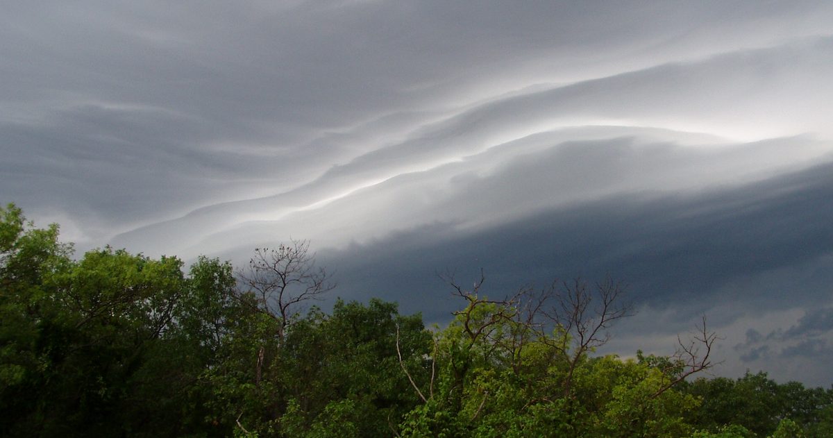
How accurate is a 14-day Australian forecast?
Forecast skill is high for a few days and fades fast - here is what the numbers say by range, why two weeks is the practical ceiling, and how to read a long-range forecast.
Read guide
What causes Australian heatwaves?
Blocking highs, northerly winds off the desert and dry soils combine to bake the continent for days. Here is how heatwaves form and how the models see them coming.
Read guide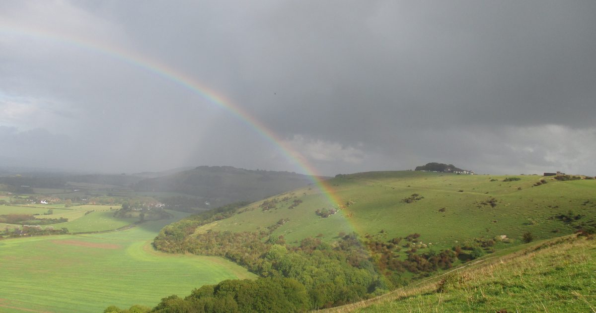
When is cyclone season in Australia?
The official season spans November to April and peaks after Christmas. Here is where cyclones form, how BOM grades them, and how to read the watches and warnings.
Read guide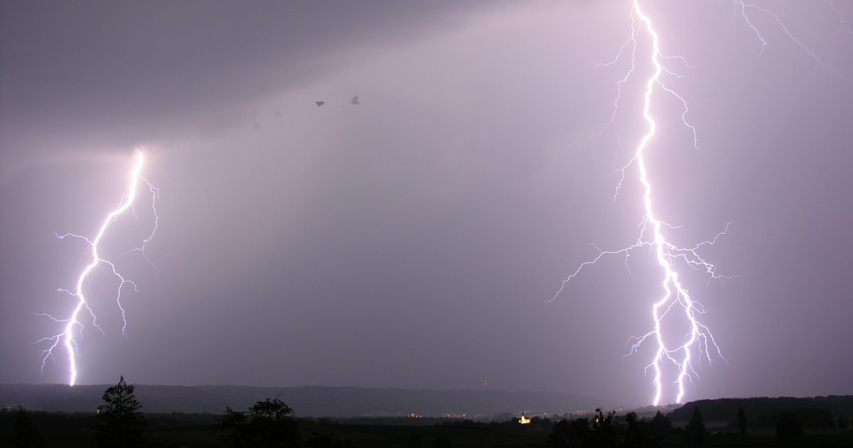
Australian severe thunderstorms and hail
From BOM's 2 cm hail threshold to the supercells that batter the east coast, here is how Australia's most damaging storms form and where they strike hardest.
Read guide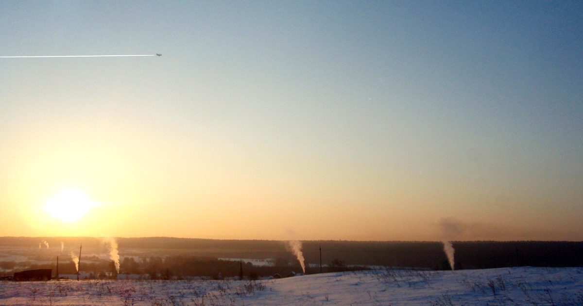
Does it frost in Australia? Where and when
Frost is a routine part of winter across inland and southern Australia. Here is where it strikes hardest, when the season runs, and why the coast escapes it.
Read guide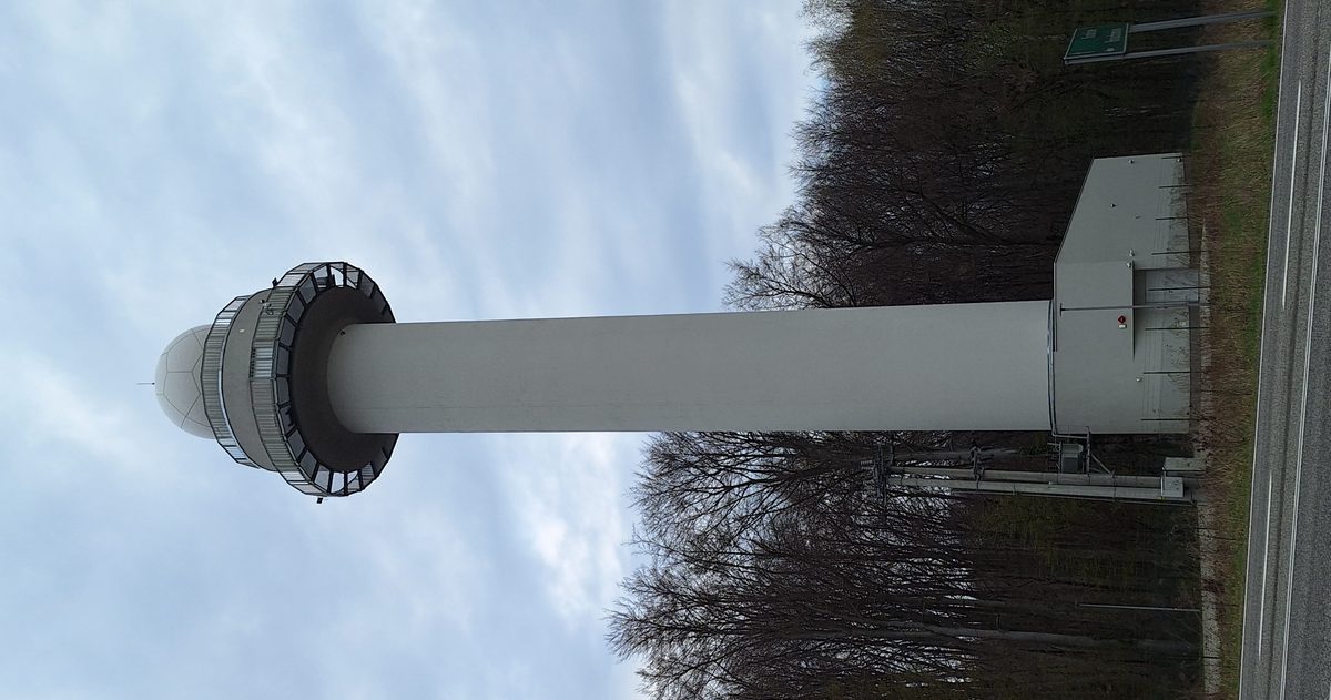
How to read Australian weather radar (the BOM radar)
The BOM rain radar shows where rain is falling and where it is heading. Here is how to read the colours, pick the right range, loop the frames and spot its blind spots.
Read guide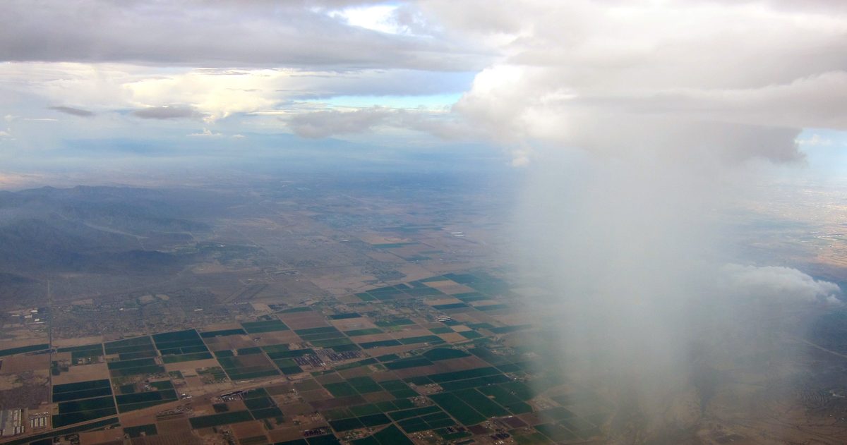
What does 'chance of rain' mean on a BOM forecast?
The percentage is more precise than it looks - and it isn't telling you what you think it is.
Read guide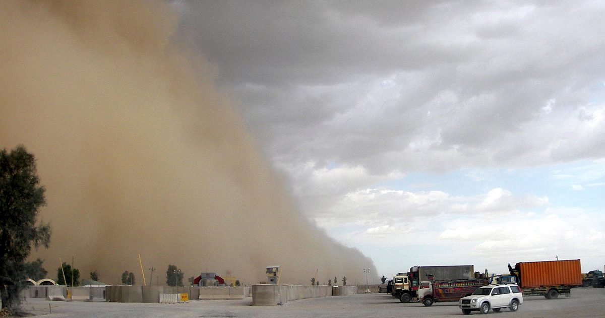
'Feels like' (apparent temperature) explained in Australia
Why the Bureau's 'feels like' can sit 7 degrees above - or below - the thermometer.
Read guide
The best time to check the forecast before you travel (Australia)
Forecasts refresh on a schedule - travel on stale data and good trips go sideways.
Read guide
BOM warning vs watch vs advice
The five alert words Australians hear - and the two systems they come from.
Read guide
How to plan around Australian weather using model data
Behind every forecast icon sit several supercomputer models that may quietly disagree.
Read guide
Why is the weather forecast sometimes wrong?
A modern five-day forecast is as good as a three-day forecast was in the 1990s. It still misses. Here is where the misses come from, and which ones you can plan around.
Read guide
Why does it smell like rain?
Petrichor is real, it has a chemistry, and your nose is absurdly good at it. Here is what you are smelling, before, during and after the rain.
Read guide
How far away is the lightning?
Seconds between flash and thunder, divided by five, is miles. Divided by three is kilometres. The number that matters for safety is 30.
Read guide
Why do earthworms come out after it rains?
The old answer, that they would drown underground, is wrong. The real answer is that rain opens a window for a worm to travel a long way without dying of dryness.
Read guide
Is a car safe in a lightning storm?
A hard-topped car is one of the best shelters you can reach outdoors. The reason is the metal shell, not the rubber tyres, and it matters for what you should touch.
Read guide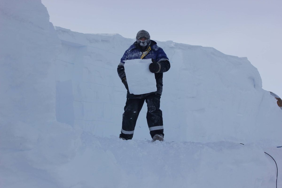
The coldest temperature ever recorded on Earth
Minus 89.2 °C at Vostok in 1983 is the official record. Satellites have seen colder, and each country has a record of its own. All of them with a date and a source.
Read guide
Red sky at night: does it really mean good weather?
The rhyme is at least two thousand years old and, in the mid-latitudes, right more often than wrong. The reason is high pressure moving from west to east.
Read guideWhat a Winter Weather Advisory actually means
It is the National Weather Service's lowest winter alert, and the one most people shrug at. The thresholds behind it, how it differs from a warning, and the three decisions it should change.
Read guideWinter Storm Warning vs Watch vs Advisory: the full ladder
The National Weather Service has six winter products that matter, and they are issued in a fixed order. Here is what each one means, when it arrives and what it asks of you.
Read guideRed Flag Warning: what it means and what changes when one is issued
It is the fire equivalent of a severe weather warning, issued when wind, humidity and dry fuels line up. Here are the criteria, the difference from a Fire Weather Watch, and why it can turn your power off.
Read guideHow to read the severe weather outlook: Marginal to High risk
The colored map on the news comes from the Storm Prediction Center, and each color is a probability. Here is what the five categories mean, when the map updates, and what a Moderate risk should do to your day.
Read guideHow to read a snow storm forecast before it busts
Snow is the forecast that fails most often, and the failure is usually one of three things. Here is how to read totals, timing and the rain-snow line so the number on your screen means something.
Read guide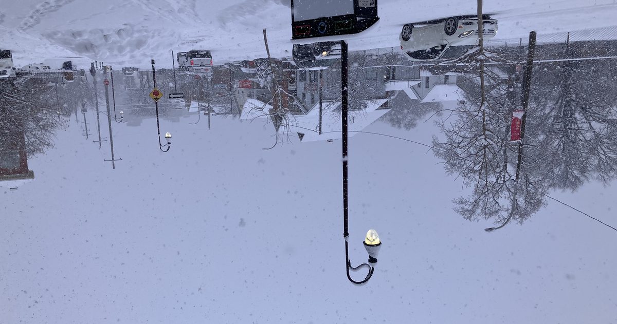
What inclement weather means, what counts and who gets paid
It is the phrase on every school notice, HR policy and airline email, and it has no official definition. Here is what usually counts, the NWS thresholds behind it, how closures are decided and what the rules say about pay in the US, UK and Canada.
Read guideHow to get weather alerts on your phone, and which ones never arrive
Your phone already receives tornado and flash flood warnings, but not watches, not advisories and not severe thunderstorm warnings unless they are extreme. Here is what arrives, what does not, and how to fill the gaps.
Read guideTornado Watch vs Tornado Warning: the difference and what to do
One is issued from Oklahoma for a region and lasts hours. The other is issued from your local office for a polygon and lasts minutes. Here is who issues each, how much time you get, and what to do with it.
Read guideSevere Thunderstorm Warning vs Watch: what each one means
A severe thunderstorm warning is the most issued warning in the United States, and the most ignored. The exact wind and hail numbers behind it, what separates it from a watch, and the one tag that means take it seriously.
Read guideWhat a Wind Advisory actually means
It is the alert for a day that will feel worse than the forecast number suggests. The sustained and gust thresholds behind it, the step up to a High Wind Warning, and the short list of things that blow away.
Read guideFreeze Warning vs Frost Advisory: what each one means
The NWS issues these only during the growing season, which is why they vanish in December. The temperature thresholds, the difference between frost and freeze, and what the warning is really asking you to do tonight.
Read guideWhat a Dense Fog Advisory actually means
The NWS issues it when visibility drops to a quarter mile or less over a wide area. Where fog comes from, why it lifts an hour after sunrise on some mornings and lasts all day on others, and the one driving rule most people get wrong.
Read guideWhat to wear in 40, 50, 60 and 70 degree weather
The number on the forecast is a starting point, not the answer. A band-by-band guide, the three things that shift it by ten degrees, and why the 8 AM and 3 PM temperatures matter more than the daily high.
Read guideWhat a weather front is, and how to read one
Every 'a front moves through Thursday' in a forecast describes the same physical thing: the boundary between two air masses. The four types, what each does to your day, and the tells that show up in the hourly forecast before the map does.
Read guideWeather vs climate: what the difference actually is
Weather is what is happening this afternoon; climate is what usually happens. The 30-year normals behind the word, why a record cold week and a warming trend are both true, and which one to use when you are packing.
Read guide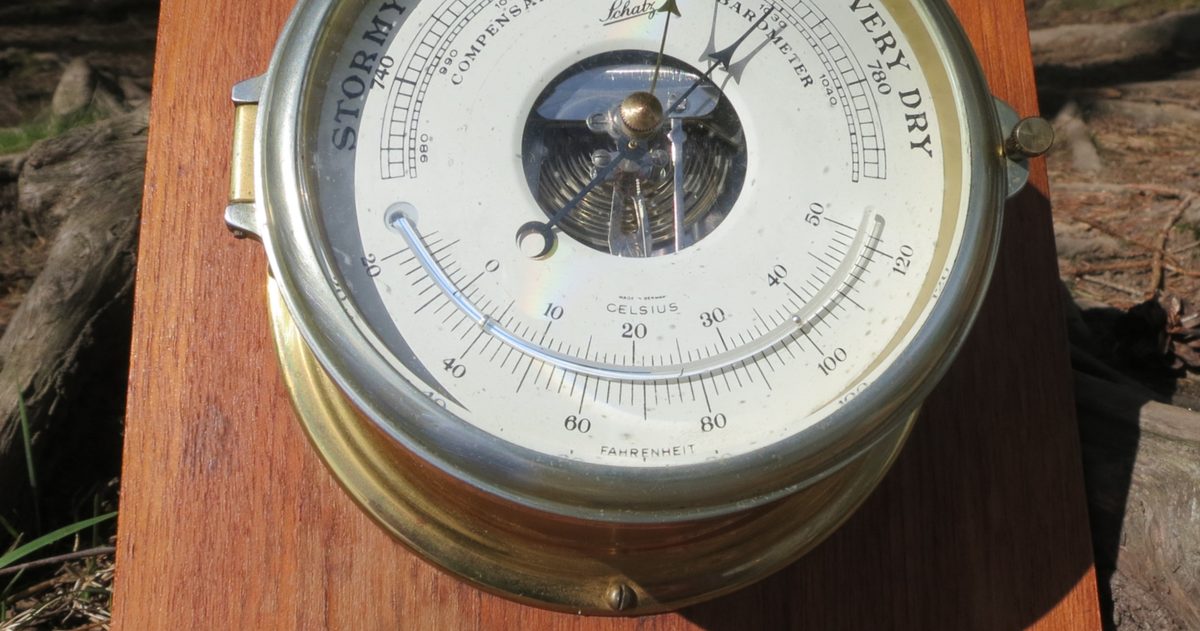
Barometric pressure: what high and low mean for your weather
Standard sea-level pressure is 29.92 inHg (1013.25 hPa), but highs and lows are defined by the air around them. How to read today's number, what the trend says about the next day, and why your phone shows a different number.
Read guide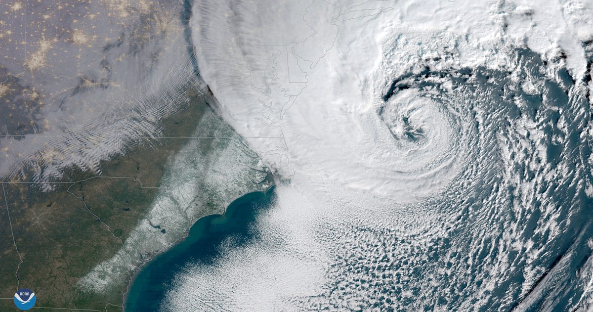
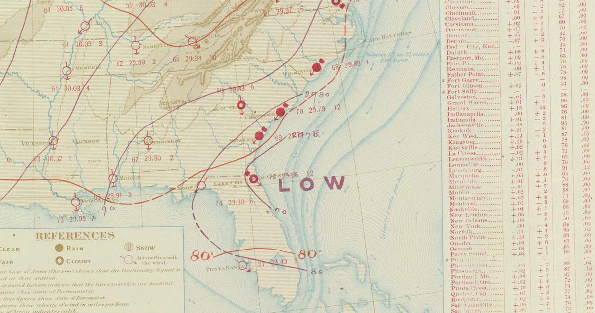
What Is a Bomb Cyclone? East Coast Lows and the 24 hPa Rule
The definition from the 1980 paper that coined it, how the threshold changes with latitude, why many severe East Coast Lows qualify, and how US nor'easters compare.
Read guide
Can cold weather make you sick?
Cold air does not give you a cold. Viruses do, and winter hands them several advantages, from crowded rooms to a nose that runs several degrees cooler.
Read guide
What does haze mean on the weather forecast?
Haze is about dry particles, not water. What it is, how a weather station decides to call it, how it differs from mist, fog, smoke and smog, and when it matters for your health.
Read guide
Indian Summer in the UK: What It Is and When It Happens
The Met Office definition, the weather pattern behind a warm autumn spell, the records it has set, and how to spot one coming in the forecast.
Read guide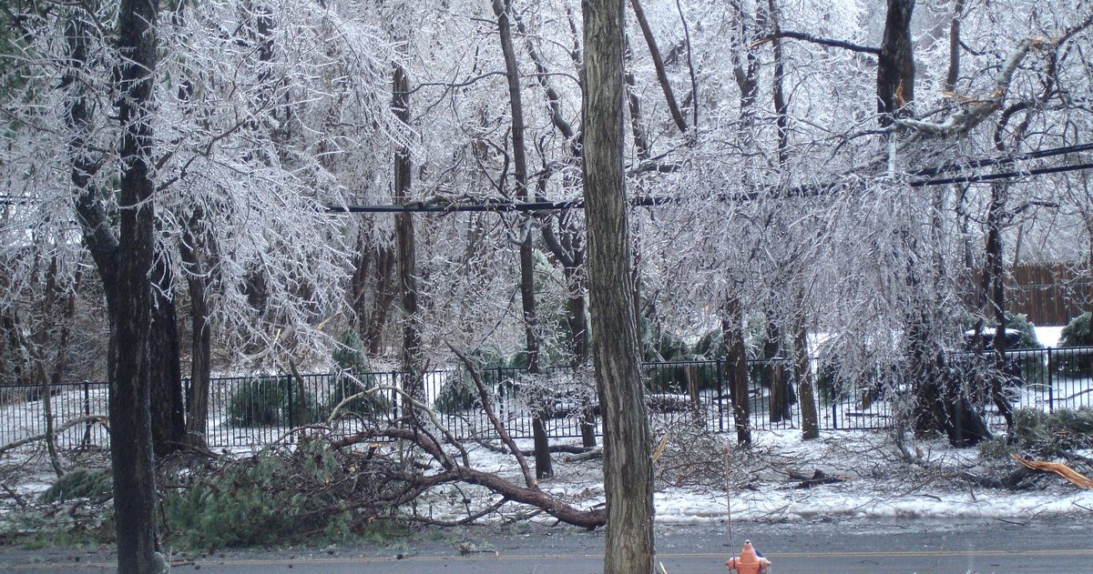
Sleet vs snow vs freezing rain vs hail: what is the difference?
One word with two meanings, and four kinds of falling ice that depend on a layer of air you cannot see. A Canada-first guide, with the US and UK terms alongside.
Read guide
What Temperature Is Sweater Weather?
Polls put it at 50 to 65°F, with 60°F (16°C) the US average. Here is what a sweater is really worth in degrees, what moves the line, and when sweater season arrives where you live.
Read guide
Can trees explode in cold weather?
No, but on a bitter night a trunk can split open with a bang like a gunshot. What a frost crack is, which trees get one, and the forecast that sets it off.
Read guide
UV Index Explained: What 3, 6, 8 and 11+ Mean
The UV index runs from 0 to 11 and beyond, and 3 is the line WHO and the US, UK and Australian health agencies all use. Here is what each band means, what pushes the number up or down, and why two apps can disagree about it.
Read guide
Weather symbols and icons explained: what each one means
Sun, cloud, raindrop and snowflake look the same in every app, but the rules behind them do not. What each icon means, what the number under it is, and where the US, UK and Australian sets disagree.
Read guide
Christmas Day Weather in Australia: What to Expect, Capital by Capital
Bureau of Meteorology December averages and Christmas Day records for all eight capitals, the real odds of rain or a scorcher, and when the Christmas forecast becomes worth trusting.
Read guide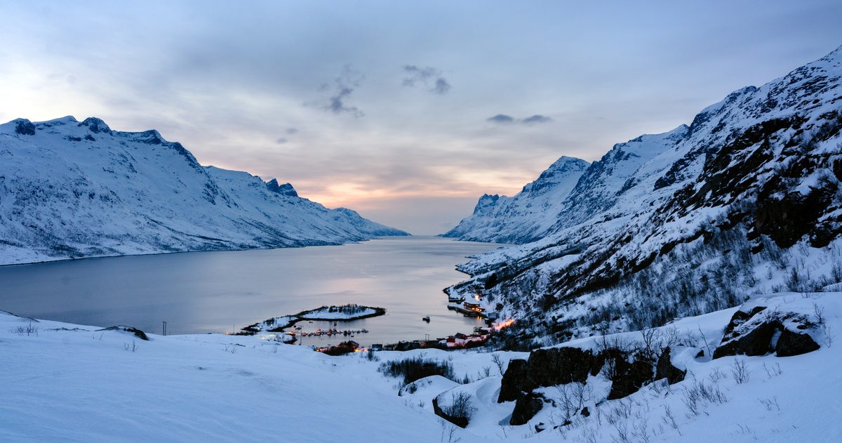
Lapland, Tromsø and Iceland in Winter: Cold, Daylight, Snow and Aurora
Official 1991-2020 station averages for December to March, sunrise and sunset from the US Naval Observatory, and why the cloud forecast matters more than the aurora forecast.
Read guide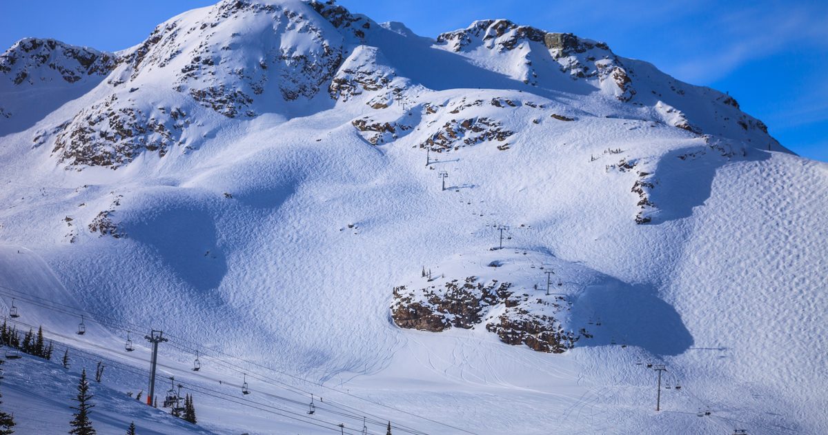
Which North American ski resorts get the most reliable snow, December to March?
Official station normals and on-mountain snow sensors, compared like for like, with each station's height against the resort's base and summit.
Read guide
White Christmas Odds by City: US and Canada
NOAA's 1991-2020 odds of an inch of snow on the ground on December 25, ECCC's 70-year Canadian record, and when to start trusting the Christmas snow forecast.
Read guide
Where Is Warm in December? Winter Sun Ranked by Real Weather
Fourteen destinations UK travellers search for in December, ranked by official weather station averages, with the rain, the cool nights and the local differences that matter.
Read guide
Where Is Warm in February? Winter Sun for Half Term, Ranked
Seventeen winter sun destinations ranked by official station averages for February: daytime highs, cold nights, rain and sunshine, plus NOAA's average sea temperature.
Read guide
Winter Sun in January: Where Is Warm, Ranked by Real Weather
Eighteen places UK travellers search for in January, ranked by official weather station averages, and how the coolest month of the year reshuffles the list.
Read guide